
Hello again!
God, Modern Horizons 2 is off to a fun start. I loved our Monday spoils! And I do like a lot of the cards for their effects – even if I don’t have space for many in current builds – but beyond the tricks its the art I’m losing my mind over.
A tiny bit of this is due to the set’s “sketch art/’art prompt’ flavor-text” showcase cards, but in general the variance of styles shown in the art prompts are giving a lot of room for some fun pieces to be published, which I for one am grateful for.
Except how it makes my life harder.
Normally I do ten art to showcase per set, but that would be impossible for MH2: it’s impossible to narrow it to ten. Too much standout art per day to try and whittle down into a small list.
So, let’s lengthen the list: let’s look at those standouts per day. When the spoiler season sends I can try to parse the list down a bit, but for now let’s just enjoy the cards we see as they are released.
With that in mind: spoiler season officially kicked off on Monday the 24th, but a few cards were shown before then to help hype up the set and even in that limited set we saw some stars. As they deserve a shout-out too, this first article in the series will look some of the outstanding pieces from those hype-cards shown between May 6th and May 20th.
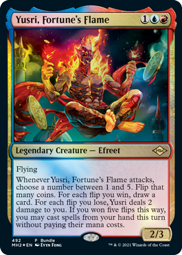
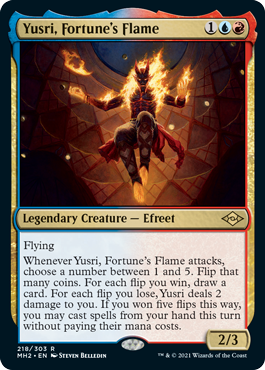
4) Yusri, Fortune’s Flame (Bundle Variant)
Of the four on today’s list, I think this is closest in appearance to the current ‘mainstream style’ for Magic art. I don’t say that as a mark for or against it or why as explanation as to it having the lowest position of the four: instead, I say that as the fact that these pieces I’m covering aren’t just going to be glorifying old-school art pieces. I enjoy the art we normally have today, just as I’m enjoying WOTC’s tentative revival of commissioning older art styles and more abstract pieces.
This art for Yusri is rich in color, from the reds and oranges of his body and flames/clothes to the way that dark ‘night sky’ above Yusri contrasts with the rest of the sky under Yusri, and with Yusri himself. Yusri’s portrayal helps show a more mischevious nature than the original art, playing with the type of personality one might see attached to such a gambling ability (mechanically and metaphorically). Yusri’s expression is well-done, and the way it shows him sitting mid-air while flipping coins is both wonderfully rendered and quite evocative for the legendary creature that he is.
All in all, Yusri feels like a trickster figure I’d imagine to be a reoccurring figure if a story were to be set anywhere around him, and its partly this art that helps sell how much I’d want to read that story.
[The artist, Evyn Fong, can be found on Twitter here and has a website for their work here.]
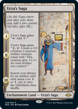
3) Urza’s Saga
I’ve got to say, I really love the style Titus was messing around with here. The background reminds me slightly of a map, while Urza and the two patches of gold – radiating from around Urza’s fist and the gold rectangle to his right – are standouts in their own way, even if I feel I should recognize that rectangle as some sort of reference. The blue and red of Urza’s robes helps provide a nice splash of color to the parchment shades he’s surrounded by, and helps ensure Urza keeps recapturing viewers’ gaze.
In general, I feel like I’d see this art painted on the wall of a temple, depicting how events unfolded around the godlike Urza (and how he reshaped Dominaria around himself). A very cool record for those who stumble upon it, and I’m counting us fans for that too.
[The artist, Drew Tucker, can be found on Twitter here and has a website for their work here.]
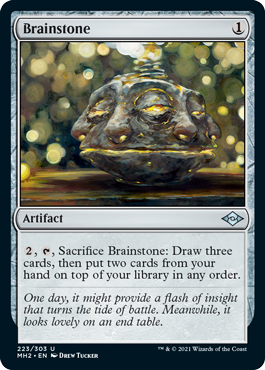
2) Brainstone
God, this one is so weird and I’m so entranced by it.
The eponymous Brainstone is extremely interesting, making me think of beherits from Berserk in terms of visual design. The brainstone’s array of faces and features blending together makes for quite a look, and the details in how the face(s) are rendered – and the color choices used to depict it, gray rock lit up with cracks of gold – help make the stone quite striking.
Beyond that, the rest of the background for the card also proves quite fun. The starry design of glinting light behind the brainstone is a fun way to set a ‘featureless’ background and a cool attempt at depicting how light can glimmer under the right circumstances, and is abstract without contrasting the stone enough to be jarring. Even the wood the brainstone appears to be resting on works quite well with both the brainstone and the background glimmer, being noticeable as its own feature while still fitting into the cohesive whole.
[The artist, Drew Tucker, can be found on Facebook here and has a website for their work here. Their art, seen in header, can be found here.]
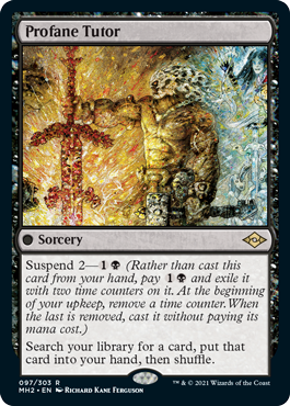
1) Profane Tutor
Yes, this made it in when Dakkon himself didn’t make the cut. And yes, there’s a reason even if I love Dakkon himself: if the cut-off was five cards he’d have made it, but my desire to keep it four cards per day meant he was the cut card between the two RKF contributions. And yes, it being a Richard Kane Ferguson piece did help this card win a spot, but that has to do with how much his art knocks it out of the park even on a regular day. Considering I consider how work to be outstanding usually and think this knocked it out of the park compared to those usual pieces, I feel Profane Tutor taking the top spot is well-deserved.
If I ever had to explain what I meant when I said I preferred old Magic’s artstyle to today’s, I would show them this and say this is what I’m here for. Dakkon’s character seems visually reminscent of 1980’s or 1990’s action protagonists like the Doom Slayer or Frank Fazetta’s depiction of Conan, and the impressionistic style RKF uses both wonderfully defines the two figures as well as doing wonders with the colors of the piece. The hammer in Dakkon’s left arm also helps contextualize Dakkon as making the blade he’s holding with his right hand, showing the blade’s glow to not only be a point of power but also the flames its being forged in.
Beyond the warm colors on the left half and how they work well with Dakkon’s form, the cold and bluish colors on the right side work well with the card instead of being jarring. Looking closely at where the colors shift from blue to the orange shades that make up a majority of the piece, I can see that a gradient between the two where RKF’s impressionistic style helps the colors slide into one another as compared to being an abrupt shift. This helps the colors come together better than other styles might have allowed.
Lastly, I love the appearance of the figure in the upper-right side of the art. Those keen with Dakkon’s history might know that as Geyadrone Dihada, Dakkon’s nemesis – I wrote a bit about her and her connection with Dakkon’s own history, if interested: you can find that here – but even without that history the card itself tells a story. The way the figure gestures and Dakkon’s head appears to be slowly deconstructed – beautifully rendered with the impressionistic style – helps give an idea as to how this muscle-bound sword-wielding figure dominating the card himself is still weak to other forces.
All in all, a masterful piece and one I’m glad we’ve gotten access to.
[The artist, Richard Kane Ferguson, can be found on Facebook here and has a website for their work here.]

One thought on “Top Daily Art of Modern Horizons 2 (Pre-Season Previews)”